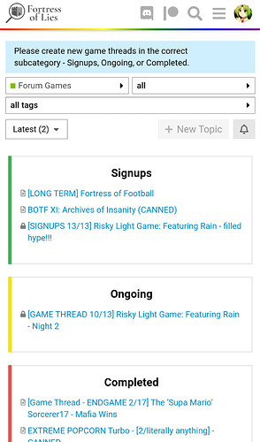
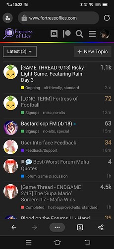
The only time that’s ever actually really useful is if you manually reload the latest categories page but until somebody specifically argues that’s a feature they used a lot and really want back I think it’s probably just not worth the effort at the moment.
i dont think it was useful
i kinda liked it aesthetically tho
it made the forum feel less flat
It doesn’t mesh well with the alternating colors, sadly, and making it do that is low-priority atm
Legacy dark seems to be working fine.
…legacy themes weren’t touched with the update
They’re legacy lol
It appears.
I can not read
If anyone using desktop vaporwave has noticed any bugs or has feedback please dm me (don’t clog this thread with vaporwave stuff)
Gunna work on fixing them up today/tmrw
wow called out
they openly said they doing it, less of a callout more of public info


 vaporwave


what even is with the new game threads warning
Everyone already knows to do that, it’s just annoying


Some people aren’t named Chloe
It’s really annoying for a reminder
Its not like your gonna be creating threads daily and it’s a deadly mistake
I set my default homepage to the top level Latest. It seems like the cleanest view and shows the newest stuff across the board.
I agree
As such I’ve gone ahead and Made It Better™
I am aware this is a big change but if possible I’d like to see what people think of it for a bit before fully reverting (plus it gives me time to figure out if making that a desktop-only change is even possible while I’m busy with the like five final projects and two final exams I have over the next two weeks)
I mean I can remove it now that people are hardlocked out
But I did need to move some stuff around earlier today so I don’t agree with your assessment 
Gonna be trying out sticky avatars - will probably be a Monday Discussion on it at some point (I don’t have any hand in those so don’t ask me what that’ll look like or when it’ll be), but in the meantime we’re gonna run a very simple version on light theme only. If anybody using light theme really hates it let me know and I can disable it - otherwise, I’d really appreciate if you could let me know if there’s any weird or buggy behavior with it.
The end goal is, pending Monday Discussion results, to make the avatar sticky on large posts but not smaller ones, but I have finals over these next two weeks so that’ll be a ways out probably.
oh this is the thread for it
idk how much work this would be but i think ideal for me would be toggleable between all posts / large posts only / no posts?


