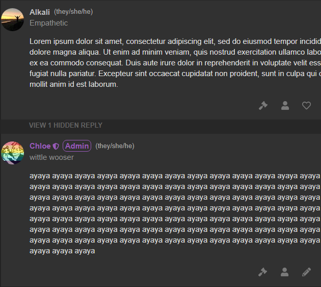
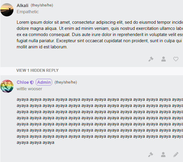
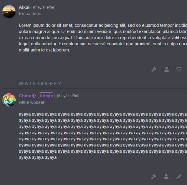
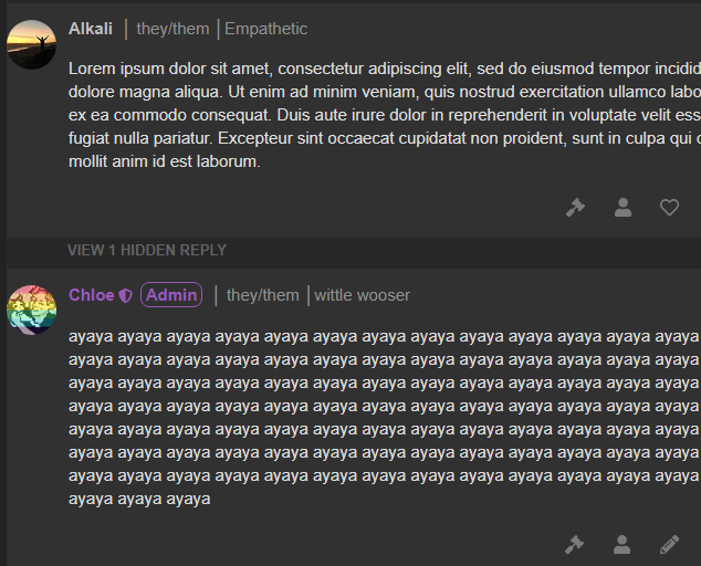
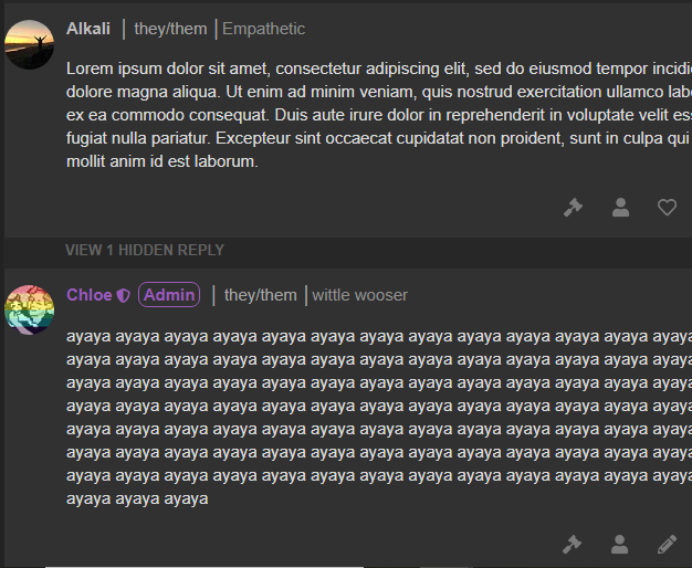
pc pictures with pronouns
i didnt think of that. i like that too
this looks great imo
add a seperator to the left as well?
this is a complete disaster
the inconsistent font size and text placement is absolute hell
I think double seperator would look best
@chloe could you post a screenshot of
Alkali | they/them | Empathetic
please?
also I think having pronouns be the same colour as the title colour would also look better

remove the awkward space difference between the username and the separator and it’s perfect
guys im mentioning bystander in every single post now
I am also fine with this and pronouns next to the name i just don’t want both on the same line
i think we don’t need brackets here if it’s just name there since pronouns are on the line below
i also don’t really like the different font size but shrug
host a tournament of pronoun display formats to decide the winner
Host a game of EiMM where everybody represents a pronoun format and the winner’s format is installed
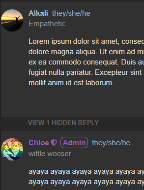
i have a minor preference for the parentheses but i’m w/e about the text size
the poll results (and feedback in the thread) are overwhelmingly in favor of implementing this feature so we will be going forward with it, and it’s now a matter of settling on a good format. I can maybe do another poll later where you vote on which screenshot you prefer
also adhd is pretty cool sometimes
i went down a rabbithole yesterday and think the optional portion will be much easier to implement than i predicted!
can i get an example screenshot for me, where my pronouns are listed as katze
It would help immensely if this could be done.
I am on vacation but Chloe thinks she’s got this one so you guys are in the same hands that made Vaporwave

