
are you saying women aren’t funny???
6 Likes
no. apologize to women
5 Likes

1 Like
![]()
4 Likes
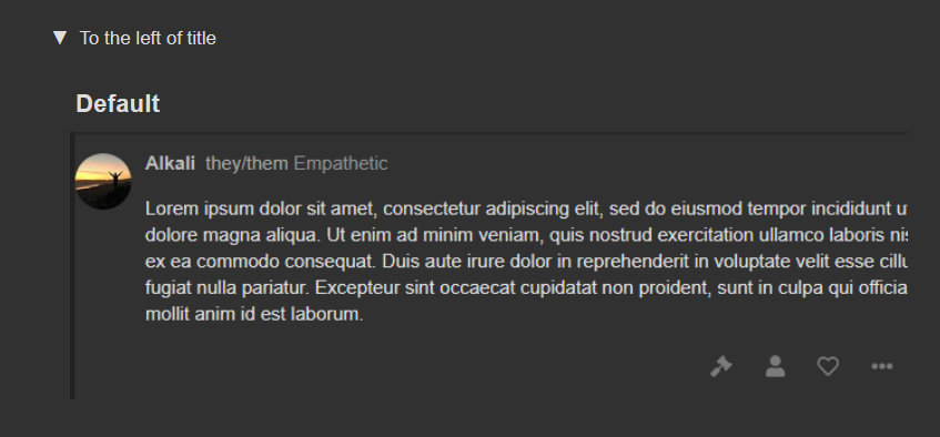
This is pretty much my preference as well, left of title with some sort of separator
i’ve seen several people who were using the pronoun field to make a stupid joke
1 Like
i think on the same line as username is too much for the people who already have mod/admin/reviewer next to their names so on the line below is my preference
but title | pronouns is probably my favorite of ones on the same line
idk why but the lower case pronouns being before a capitalized title hurts my brain so i don’t like the other way round
1 Like
like
ElizaThePsycho (Reviewer) Empathetic | she/her
is a bit much imo
1 Like
this better be an option when it drops
okay let me rephrase
MOST people are reasonable and don’t use the pronoun field to make a stupid joke. and i know this etc etc
4 Likes
I feel like most of the jokes using the field will happen within the first week of this being implemented, after which the novelty will fade away.
1 Like
i think it should be optional because all options look bad and cluttered
3 Likes
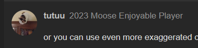
i dont know if it was intentional but its great that the font is this color
there is a gradient of the shade - name is white, pronouns are more grey-ish, title is even more grey-ish
like thats just perfect, it looks smooth on the eye and you dont need an extra symbol to distinct them. you can just use the slightly different font color to distinct them
1 Like
or you can use even more exaggerated change of shading to make the separation even more visible
i think symbols (like | or [ ] ) stick out and focuses the viewer attention to them. wouldnt be my favorite for it to be on every post
and i think putting them below the name is unnecessary clutter. it creates an entire line of empty space (the one with the pronoun)
1 Like
putting it on the line with 3 other things already seems more cluttered to me
making a line of empty space isn’t really clutter because it’s empty space
i feel like no one is factoring this in so an example with one of these would be good
1 Like
alternatively,
its not any more cluttered than my title
my title says 4 different things, all with space between them
maybe clutter is the wrong word, but a whole empty line just feels wasteful to me
if that was the logic used in webpage design then everything would look like the MU fluid themes but they don’t
stuff isn’t designed for maximum space efficiency it’s designed to look digestible
…and you would be adding something more to that, no?
1 Like