There are ways to improve the experience of using generative AI without giving it more images! Improving fine-tuning settings accessible to end users and such. There are even ways to improve the general quality of AI images without changes in the technology itself which I think will almost certainly happen as people get more experienced with the technology. People are going to get better at working within its limitations, at subverting its limitations, at using its unique advantages to make more interesting art. More people are gonna get frustrated wit the normal limits and start looking into controlnet shit and imagetoimage and what have you.
I actually find good AI art to be much more interesting than good normalpeople art because it’s less common to make, fewer people are doing it, that means it’s a lot more novel and cool to see. Here are some of the cool bits of AI art I have reblogged on tumblr recently
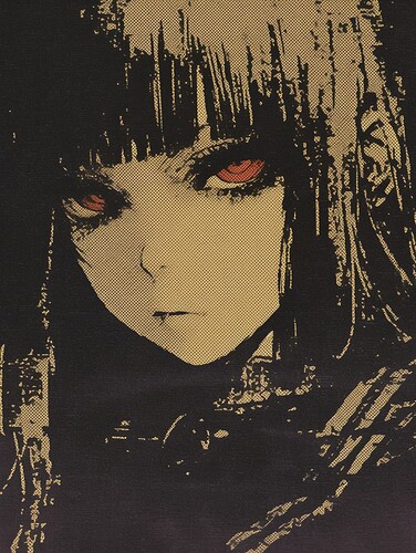
(by @reachartwork on twitter/tumblr)
Awesome negative space and use of colour here, awesome texturing with the screen tons. The thing I dislike about a lot of the “generic midjourney style AI art” is that it’s over-rendered, it’s like… do you remember Magnus’s temporary new avatar? I didn’t clock it as specifically AI at the small scale but I’ll admit I didn’t like it as an art piece very much because the fur detailing was way too much, your eye had nowhere to rest. It’s easy for AI gen to make something super detailed, it’s no longer technically impressive, so it ends up being distracting and superfluous. This is a super simple piece and it looks great because of it, and that’s something that I really think shows mastery over the medium - when do you stop being wowed by how detailed something can be and start knowing when to reduce that detail to make something aesthetically better? This is aesthetically very pretty. I love it very much.
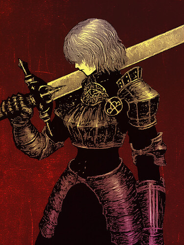
(by @reachartwork on twitter/tumblr)
Look, this image is Awesome. It’s Sick As Fuck. And it’s part of a series of “witch-knights” this artist has been doing which are an example of, like, synthesis of two existing things to create a novel concept. People have made witch knights before, but it’s not an oversaturated enough concept that it’s purely something that was present in the dataset that’s being mimicked, the generator is taking traits of a witch and traits of a knight and mixing them. And I think it’s really interesting and cool and also they all look fucking awesome.
It’s a great way to get something novel and interesting from a machine that takes averages, you know? You can combine two averages to get something new. Very few traditional artists actually invent an entirely new style of rendering or colouring or what have you, creativity almost always comes from blending different styles, diferent subjects, different colour palettes, in ways that haven’t been done before. This style is kinda similar to the last one so I don’t have a ton new to say on it that I haven’t already said, still impressive in its holding-back on detail, but it’s got more oclours and such, it’s super super pretty, I especially love the yellow-purple gradient on the armour shading and the use of pure black silhouette
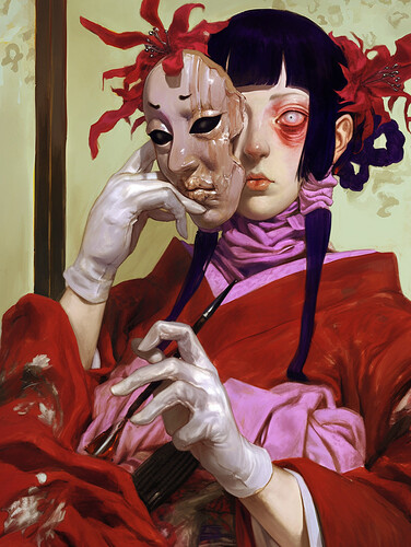
(@reachartwork on tumblr/twitter)
This is just a really cool design and art style (an art style very different from hte last two images, but the same artist! She is able to switch art styles much more readily than a traditional artist would, and her work is better for it), and it expresses a set of aesthetic preferences you don’t see in boring AI art. This artist does a lot of gore-y stuff which is what drew me to her as a creator inhte first place, I haven’t picked out any of it because I don’t want to post gore proper on this web site, but this is perfectly tame so I’ll post it.
She’s fucking tired, she’s half dead, she’s taking off a mask, she’s beautiful but not in a generic gorgeous way, and look at those hands, super super impressive hand for AI. See, there’s markers of skill and technique here like in normal art! I bet she worked a while to get those hands perfect, just like she did in hte witch-knight-surfing one! The colours are really nice, they really emphasise hte sickliness on display here, I love the way the flowers sort of “grow” out of her head and feel like they’re overtaking her, I love the gradients in her purpley hair, I love the gloves and covered skin that give her, like, an almost-medical feeling.
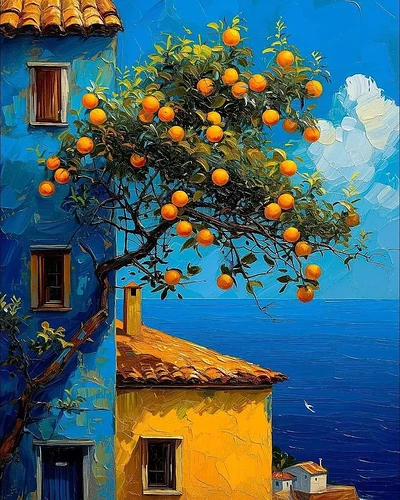
(by Juan Brufal)
This is just straightforwardly a pretty painting, it’s very very nice to look at, I love looking at it, and I also find some kind of interesting, like, meta-artistic tension in how… this kind of colour scheme, this style of painting in general, people treat it as so cool and unique when it’s genuinely kinda a-dime-a-dozen. It’s very very pretty but it’s not novel, there are so many people making pictures that are pretty like this one is, and seeing it done with AI is - well, first of all it’s still just as gorgeous as the hand-drawn ones, this is a particularly well-executed example of that super ocmmon style, but it’s also fun and interesting to my mind.
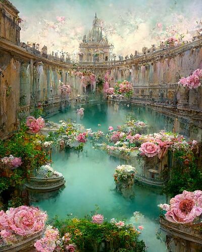
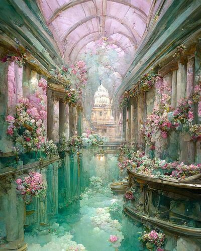
(by euphemia.stokefield on Instagram)
And as opposed to the last picture, which I found to be enhanced by being AI because of how it replicates a style praised as “unique”, here’s a set of images that are enhanced in their communication of aesthetics and ideas by being AI. These are so so dreamy and ethereal, the reflections are slightly off but not fully (which contribute sto that sense), it’s just a PLACE you can be in and see those endless little smudged details fading off into the background that are so characteristic of AI and it enhances rather than distracts from the art, it feels like when you try to focus on something super hard in a dream. I could stare at these for days. Beautiful beautiful beautiful beautiful. The lines bend - that’s something I look for when trying to figure out whether photos are generated by AI, if the perspective lines are wobbly, it makes it so dreamy. The colours… the flowers… I love them so
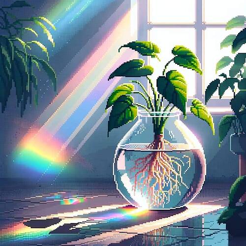
By @uwupostxng on instagram
This is AI pixel art! One way to spot AI pixel art is that it often doesn’t stick to a grid, the lines get wobby and blurry and there’s light that shines through the cracks, so to speak.
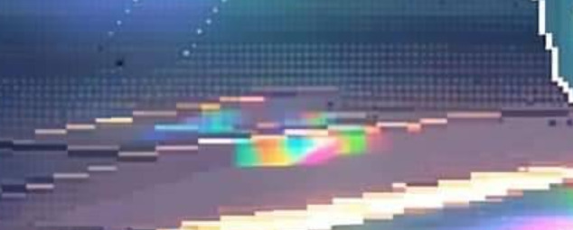
Zoom in on this part and you can see it really easily. Some of the dithering almost looks like screentone.
THIS ENHANCES THE ART GREATLY. Breaking the “rules” of pixel art allows everything to look like it’s really glowing, those little bits of rainbow lighting are so beautiful and wouldn’t work with traditional pixel art. Like the last one, the habitual traits of generative AI as a medium allow this art to be better than it would be if made by hand. I don’t have to sing this one’s praises because it’s just very straightforwardly pretty and everybody knows this.
